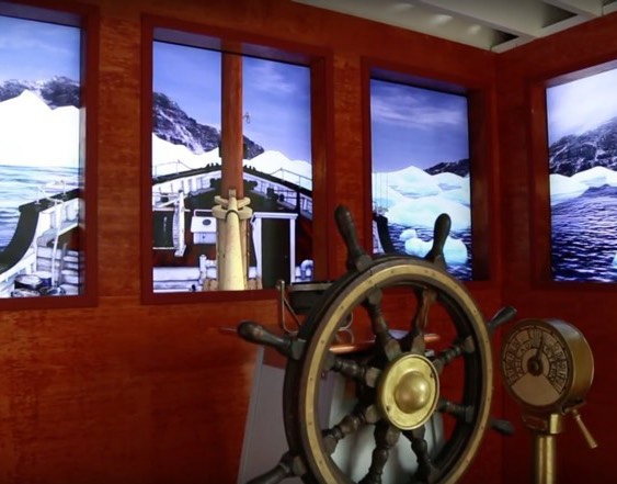
Actual touchscreen at the Vancouver Maritime Museum
Photo from Museums + Heritage Advisor
Photo from Museums + Heritage Advisor
Vancouver Maritime Museum TOUCHSCREEN
-- o-0-o --
The Vancouver Maritime Museum (VMM) presented the CDM team with the challenge to create two digital artifacts for their upcoming exhibition.
Our team, comprising eight individuals from different backgrounds, was presented with the challenge to scope the extent of the projects and ensure the delivery of one or both in a 13 week period.
After careful consideration, the team decided to build both projects:
After careful consideration, the team decided to build both projects:
The Wheelhouse Experience, an interactive creation of navigating through the arctic, would be the main delivery for the VMM. To ensure timely delivery, the project would be created with a mixture of CGI and live photography.
The team's 2nd delivery is a Touchscreen Experience, aimed at museum users who were physically unable to board the St. Roch.
-- o-0-o --
TEAM MEMBERS:
Amy Lee: Software developer
Carolyn Fung: Account Manager
Erick Delgado: Cinema/ Video Documentary Editor
Duong Tran: Digital Designer (Art direction, 3D junior designer)
Hyunchul Jung: Senior Animator, 3D designer
Juan Lara: Software developer/ Electrical engineer
Michael Larsen: Developer
Ryan Meech: Physical prototype maker
Our blog:
http://blogs.thecdm.ca/truenorth/
Article about VMM interactive touchscreen:
Haley Sharpe Design navigates new visitor experience for Vancouver Maritime Museum
Article about VMM interactive touchscreen:
Haley Sharpe Design navigates new visitor experience for Vancouver Maritime Museum
HOW TO SOLVE PROBLEMS IN THIS PROJECT?
With only 2 weeks left, the team has to simplify the execution and ensure that storytelling is successfully added into the screen. After a long meeting with our client and representatives from Haley Sharpe, we receive crucial feedback and information on how we should present info of the ship.
As viewer can see, a 3D model ship has many perspectives and there are plenty of ways (operations) to present info with it, but what is the best way to present the ship?
Life on the Arctic area is not all about the ship and the surrounding environment, but it is also about how people manage to survive through such harsh environment, what are their daily routines, how they use specific sections of the ship and how these sections serve functions on maintaining the lives of people on the ship.
This is an interesting UX-integrated-with-storytelling problem that we need to solve. Previously, we had shown the clients of how to explore the ship with just 1 horizontal slice, but after the meeting, we knew that it's not the ultimate solutions.
The team gather together again and agree that the ship should be shown in 4 views which are:
- Perspective view (the overall view to show material and outside appearance of the ship)
- Front view (to show how beams undergo ice pressure)
- Side view (story of life on the St. Roch ship) and
- Top view (ship sections with specific functions).
3D Modelling done by: Hyunchul Jung
Brand guidelines and colors from Vancouver Maritime Museum
Art direction and style guide done by: Duong Tran
Art direction and style guide done by: Duong Tran
See the St. Roch with Green grid – Wireframe
Exploring the St. Roch in 3D model with an interactive touchscreen
See the St. Roch with Green grid – Wireframe
Exploring the St. Roch in 3D model with an interactive touchscreen
User flow presented by UX designer team
UI for the touchscreen
Art direction and UI design done by: Duong Tran
Hand animation done by: Hyunchul Jung
Art direction and color correction done by: Duong Tran
Animated Instructions
Art direction and color correction done by: Duong Tran
Animated Instructions
PERSPECTIVE view:
Rotate the ship 360 degree
FRONT view:
View how Beams and Ice breaker function
3 arrows represent ice force
3D elements (ice pressure and point of interest) done by Duong Tran
TOP view:
View different sections of the ship
TOP view:
Explore sections of the ship in details and view 360 degree images
Art direction, color correction, 360 image retouching done by: Duong Tran
SIDE VIEW:
Stories about life on Arctic Ocean
Photo taken by: Erick Delgado
Photos retouched by: Duong Tran
Photos retouched by: Duong Tran
Photo taken by: Erick Delgado
Photos retouched by: Duong Tran
Photos retouched by: Duong Tran
Actual touchscreen at the Vancouver Maritime Museum
Photo from Museums + Heritage Advisor
Photo from Museums + Heritage Advisor


